

Panama UI
3,000+ meticulously crafted components ensuring speed and accuracy between design and code.
Panama UI
Lorem ipsum dolor sit amet, consectetur adipiscing elit. Suspendisse varius enim in eros elementum tristique. Duis cursus, mi quis viverra ornare, eros dolor interdum nulla, ut commodo diam libero vitae erat.

Medium length hero heading goes here
Lorem ipsum dolor sit amet, consectetur adipiscing elit. Suspendisse varius enim in eros elementum tristique. Duis cursus, mi quis viverra ornare, eros dolor interdum nulla, ut commodo diam libero vitae erat.

AI Product Transformation
Lorem ipsum dolor sit amet, consectetur adipiscing elit. Suspendisse varius enim in eros elementum tristique. Duis cursus, mi quis viverra ornare, eros dolor interdum nulla, ut commodo diam libero vitae erat.
Overview
Just as the Panama Canal transformed global shipping by connecting oceans and saving time, Panama UI was built to bridge design and engineering—streamlining collaboration and boosting efficiency.
My Role
I led the design and development of Panama UI from the ground up—setting up the entire library, defining design standards, and collaborating closely with engineering to implement and continuously evolve the system as the product scaled.
Impact
- 3,000+ custom components
- Organized library made it easy to rebrand in less than a day
- Design & development move 10x faster
- Happy engineers
Speed is critical in the seed stage of a startup—but I knew from experience that skipping a design system would cost us more later.
We initially tried using Shopify’s Polaris, but both design and engineering quickly ran into limitations.
It lacked the flexibility we needed to build the product we envisioned, leading to frustration and slower execution. While building a custom system is a luxury, we were fortunate to have the right team to take it on.
Craft a dynamic design system with a dual focus: build a versatile library of components and patterns while ensuring effortless visual updates. This system is designed to adapt to our evolving brand, supporting current needs and future aesthetic enhancements for growth.
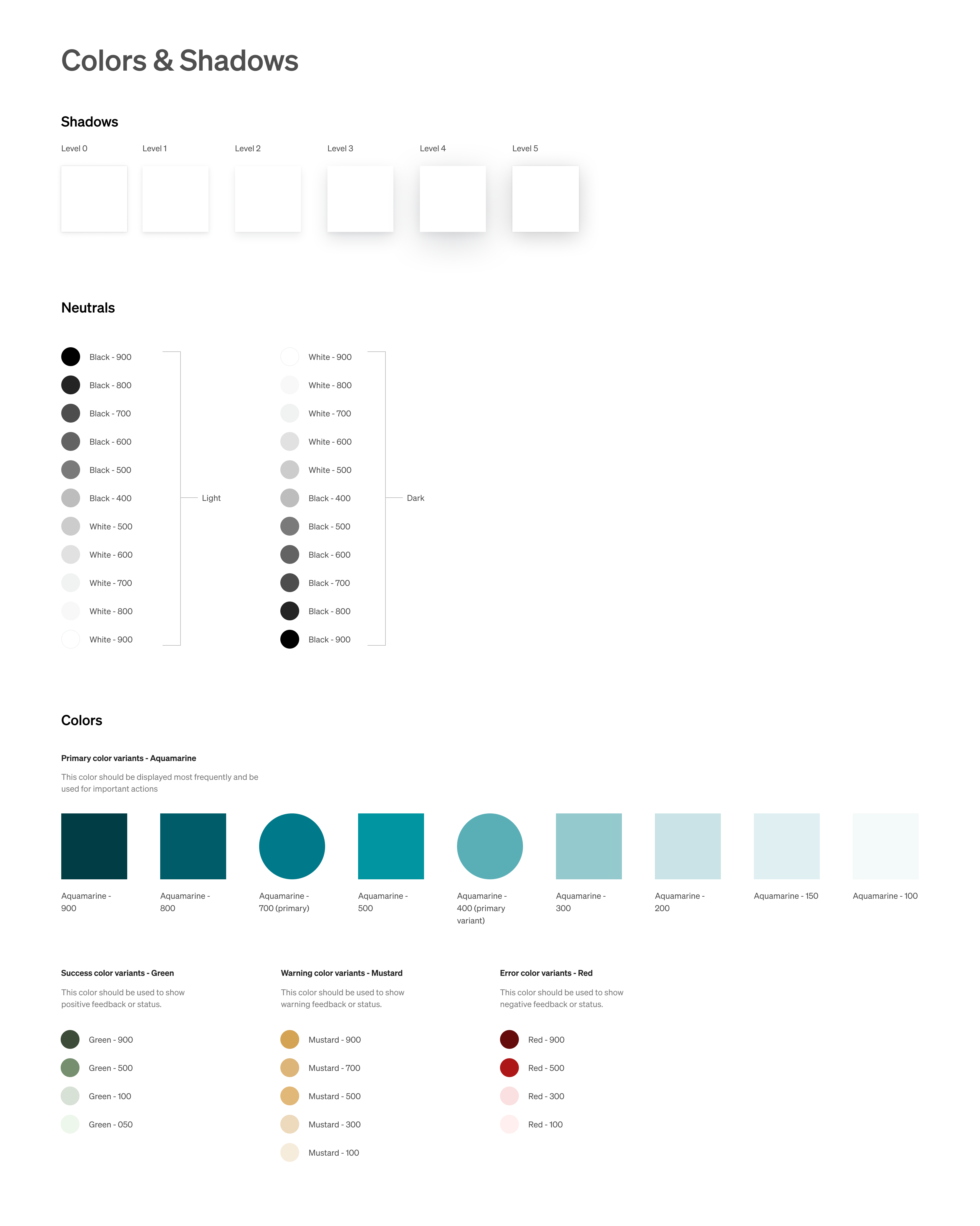
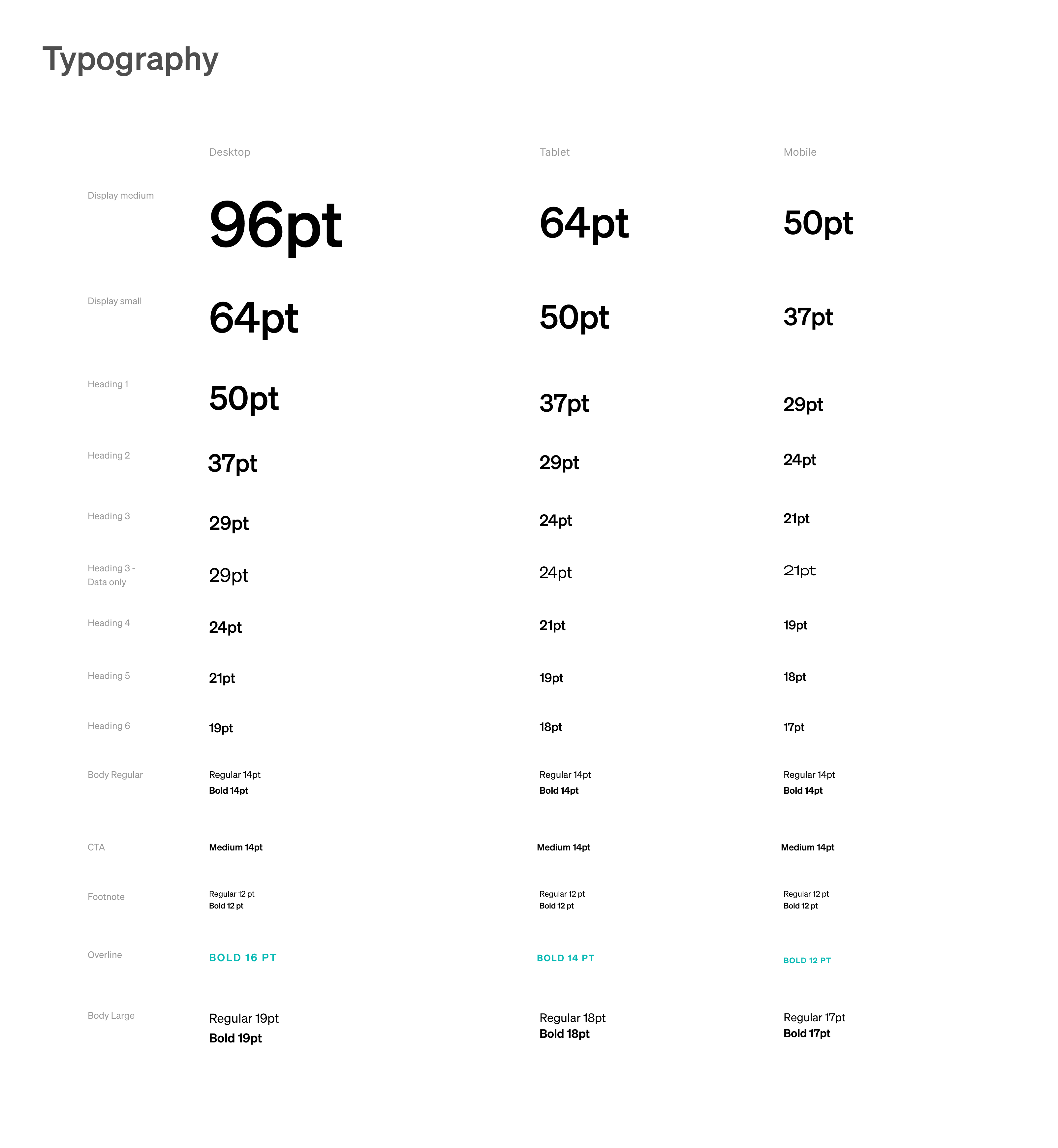
Design Tokens
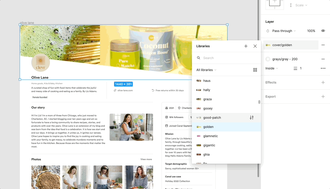
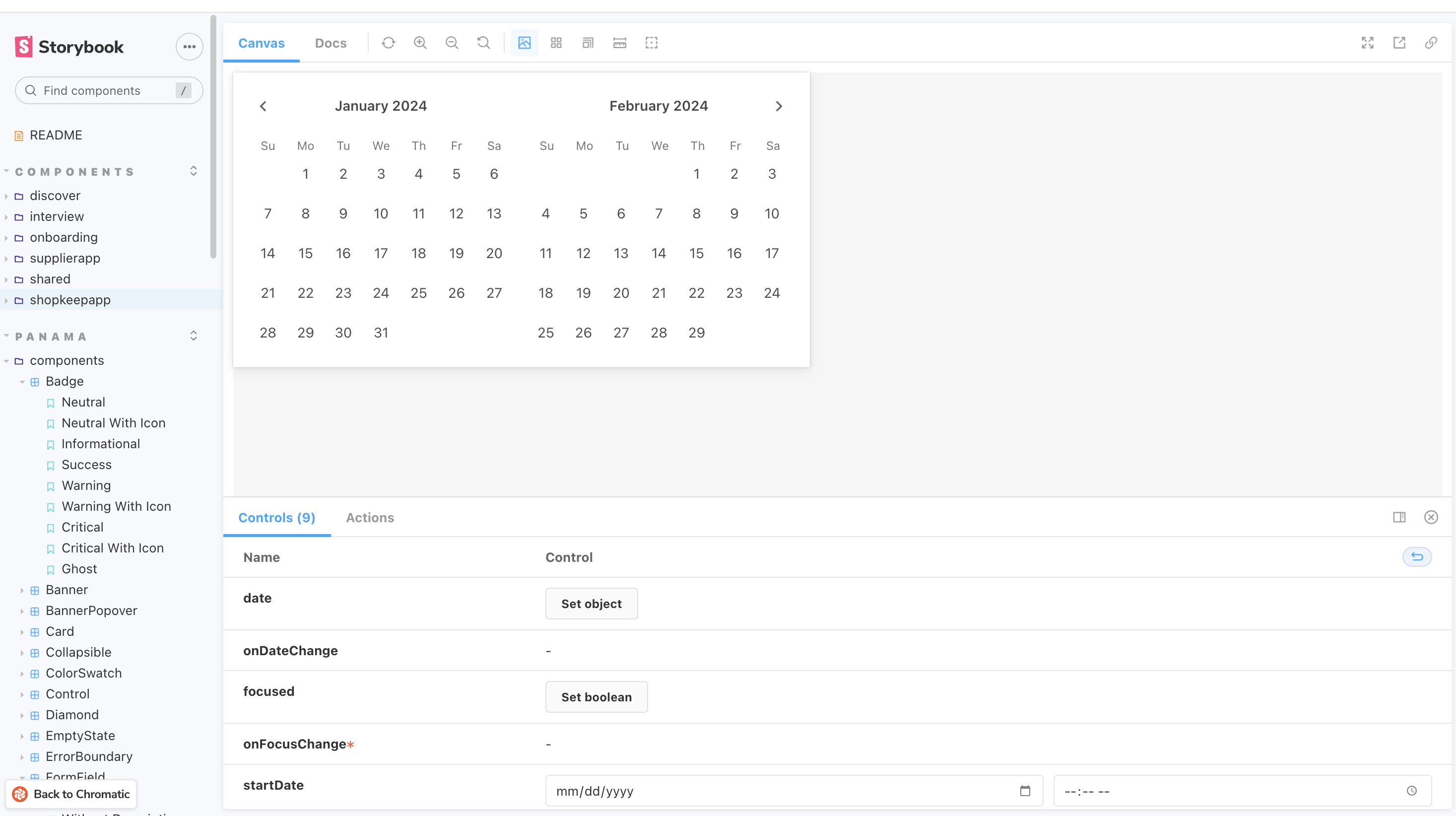
Colors, shadows & typography were set up in Figma for easy access for designers which align with our Storybook for the FE team.
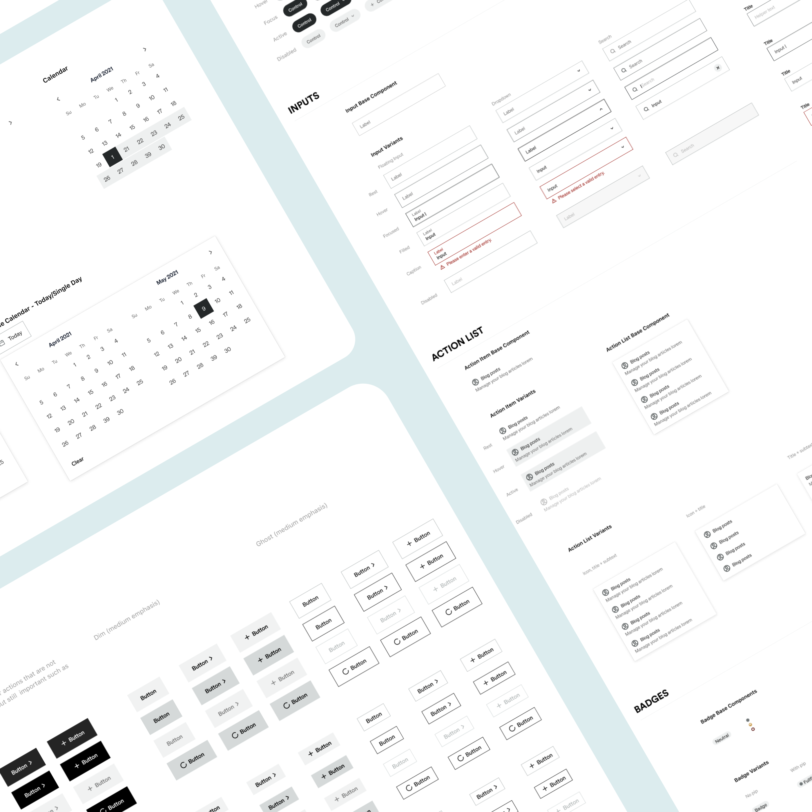
Configuring Components
Buttons, controls, inputs, action lists, badges, checkboxes and more! This has accumulated and grown over time, of course! We didn't have all of this to start.
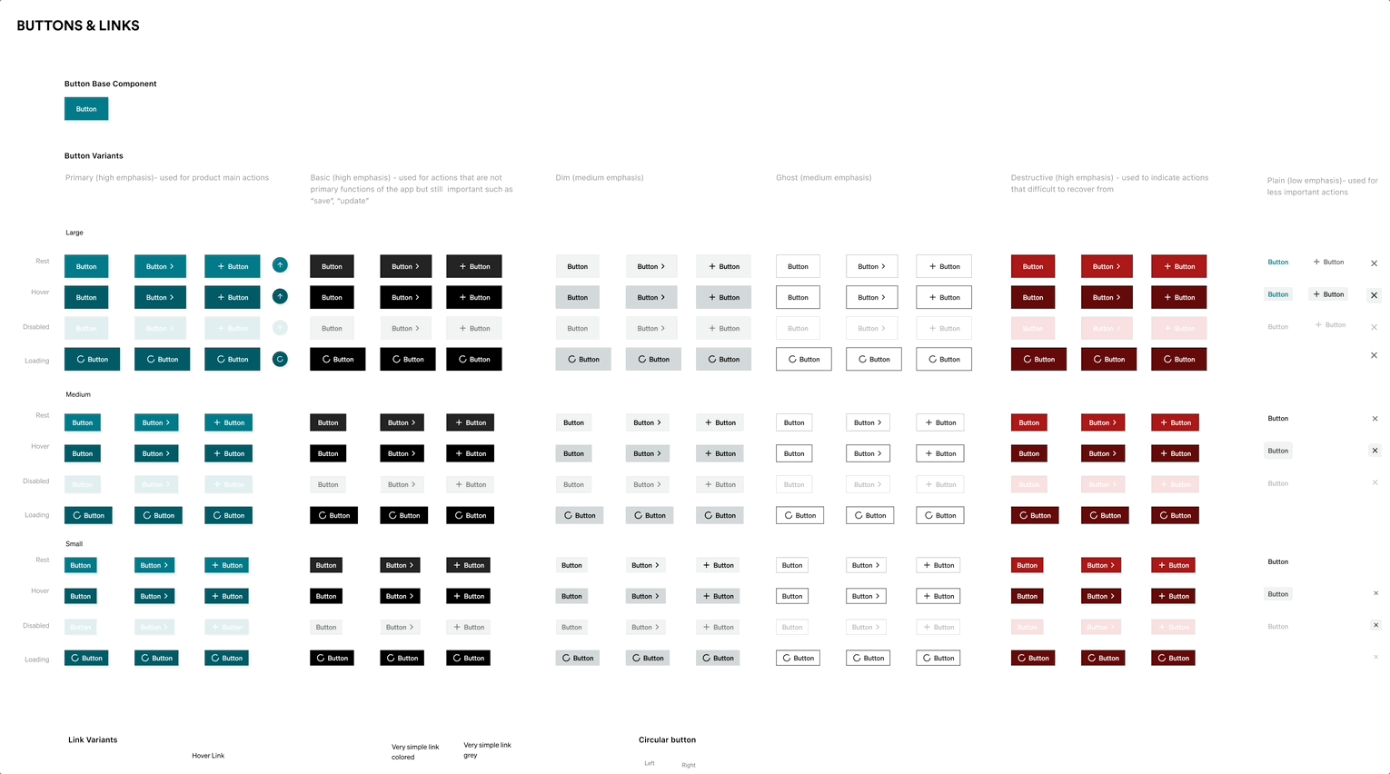
Using Base Components
Base components (all signified with “.base” at the beginning of the name) were used throughout any change in spacing, text style, etc could be switched and aligned across variants.
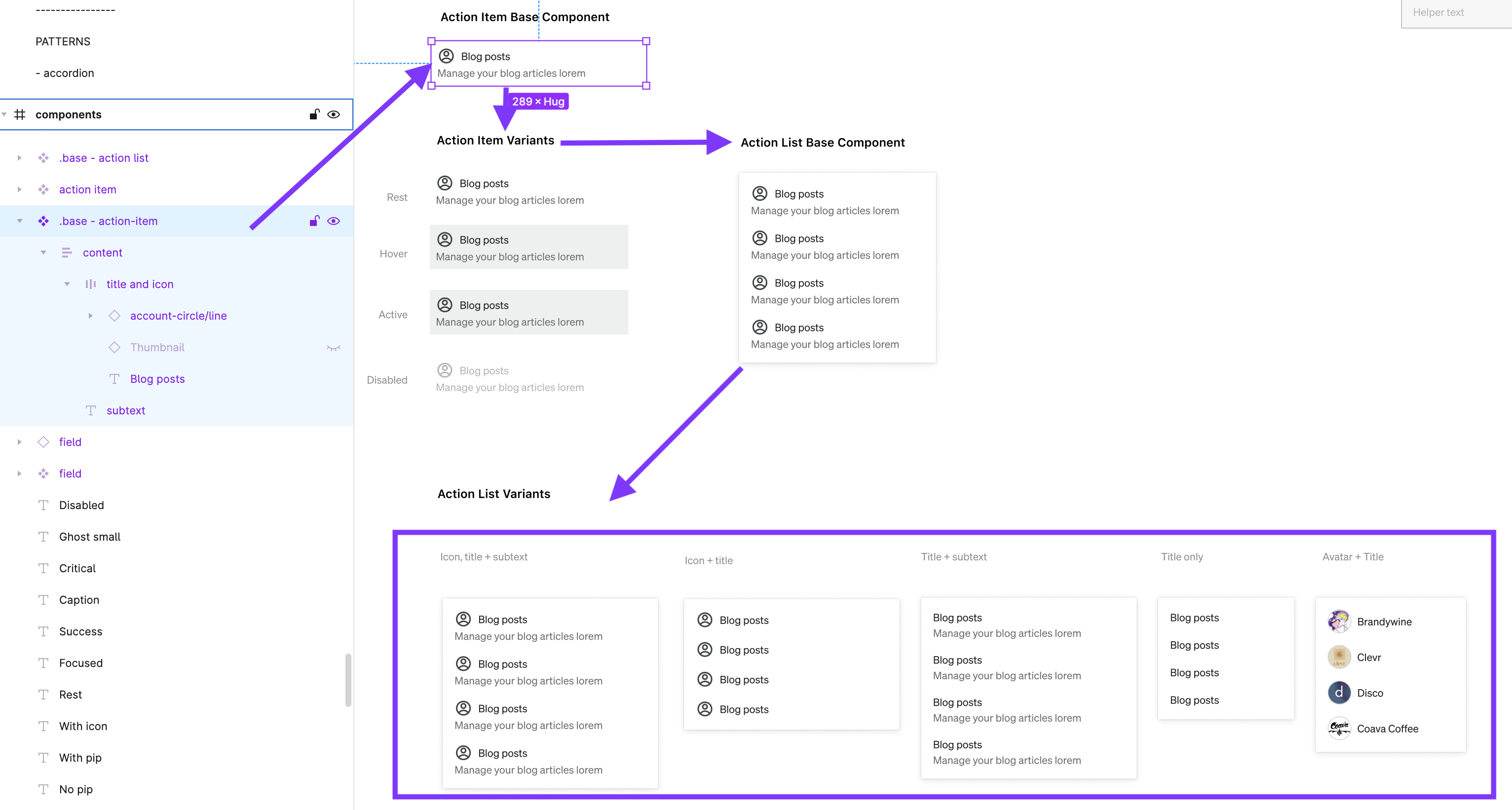
Patterns
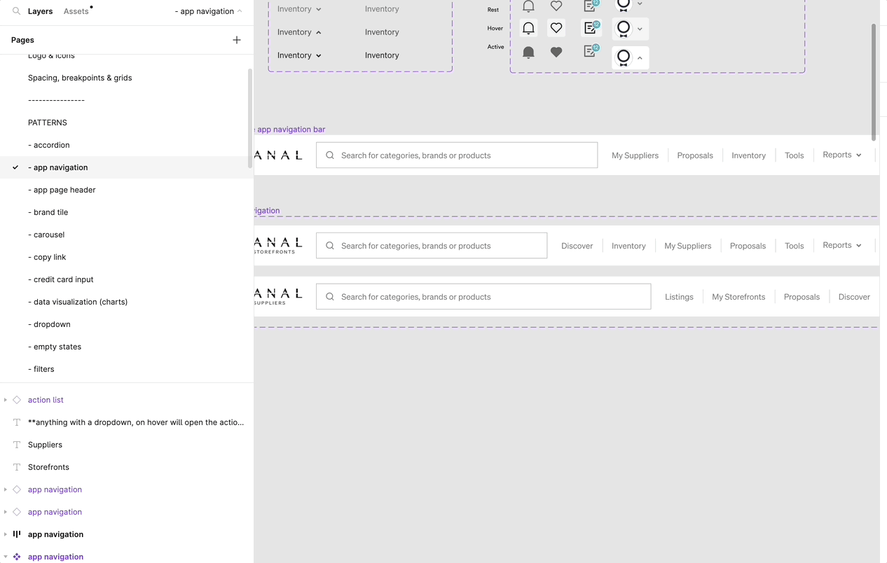
Once core components were in place, we built patterns based on usage across the app—each made from .base components to allow easy, scalable updates.
The benefits of a base component: changing in one place changes in all the variants.
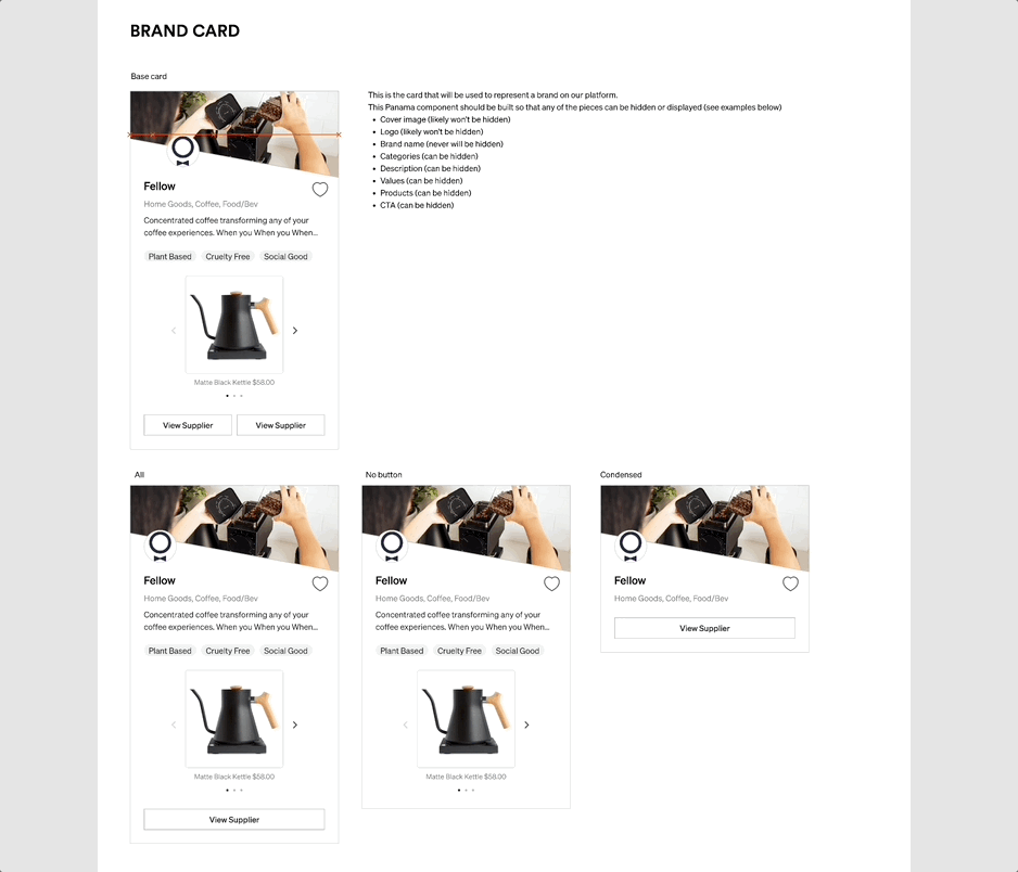
Beyond components and patterns, the library included logos, banners, and product images—enabling the design team to quickly build realistic, visually integrated prototypes.
My absolute favorite part!
I wrote a blog post on the powerful Panama UI table system—check it out or watch a quick Loom walkthrough below. It’s been a huge time-saver and frustration killer.
Evolving with the Product
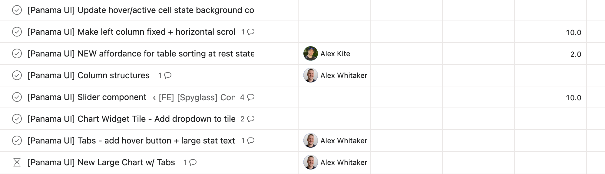
A design system is great and all, but if processes are not in place to maintain and continually add to it, then it is not as useful. When we're designing projects, we first always try to design with existing components. If something new is needed, then we will clean it up and create it in our Figma design system. Once it's ready to go and documentation is written, an asana task is assigned to Engineering. They then create the components in Storybook so that all of engineering has access to use it.
What would I do differently?
If I were building a design system today, I’d explore more flexible libraries upfront. When we created Panama UI, options were limited—and engineering preferred building from scratch to ensure full customization and speed. It made sense then, but today’s landscape offers more out-of-the-box tools that could save time without sacrificing flexibility. With a strong team, we were able to build the system efficiently.