

Mobile App Redesign
Led the redesign of the mobile app, which resulted in app revenue increasing by 20%, conversion by 10% and the app store rating rising from 3.5 to 4.9 stars.


Medium length hero heading goes here
Lorem ipsum dolor sit amet, consectetur adipiscing elit. Suspendisse varius enim in eros elementum tristique. Duis cursus, mi quis viverra ornare, eros dolor interdum nulla, ut commodo diam libero vitae erat.
AI Product Transformation
Lorem ipsum dolor sit amet, consectetur adipiscing elit. Suspendisse varius enim in eros elementum tristique. Duis cursus, mi quis viverra ornare, eros dolor interdum nulla, ut commodo diam libero vitae erat.
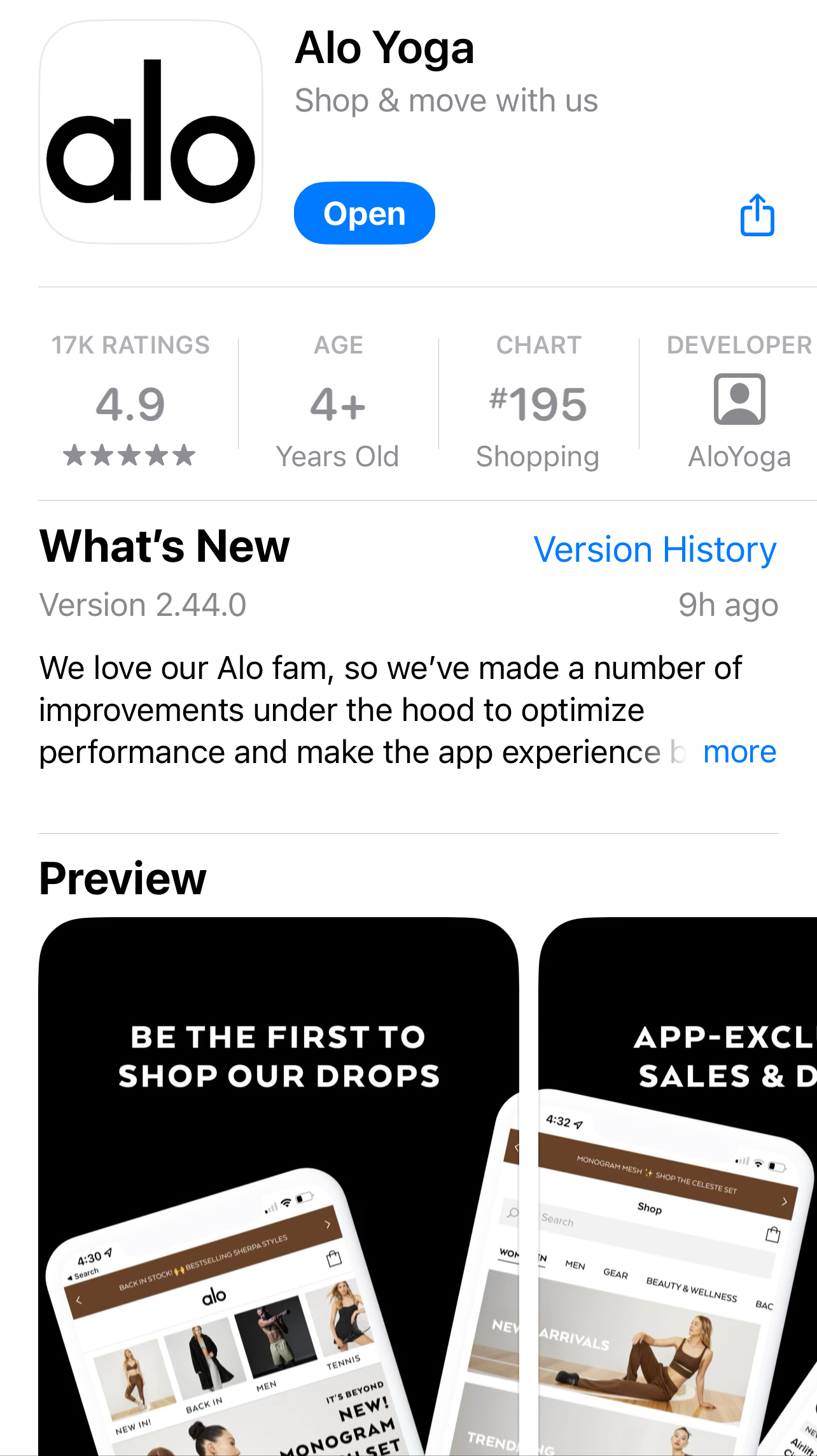
Alo Yoga
Led the redesign of the mobile app, resulting in app revenue increasing by 20%, conversion by 10% and the app store rating rising from 3.5 to 4.9 stars.

Overview
We launched an MVP web wrapper app in early 2020, but as the contract neared expiration, we opted to build native iOS & Android apps for better performance and scalability. We set out to improve mobile app experience to grow traffic and increase revenue.
My Role
As the lead product designer, I led end-to-end design efforts for the new Alo Yoga mobile app. I conducted user research, pitched concepts to leadership, and collaborated closely with a development agency in India, the Director of Product Management, and our in-house engineering team to bring the vision to life.
Impact
- 10% improvement in conversion rate
- 20% increase in app revenue
- 46% improvement in app speed
- From 3.5 to 4.9 iOS app store rating
While the existing Alo Yoga mobile app drives strong conversion, frequent bugs, sluggish performance, and a lack of key features create friction in the user experience—ultimately putting customer retention and brand perception at risk.
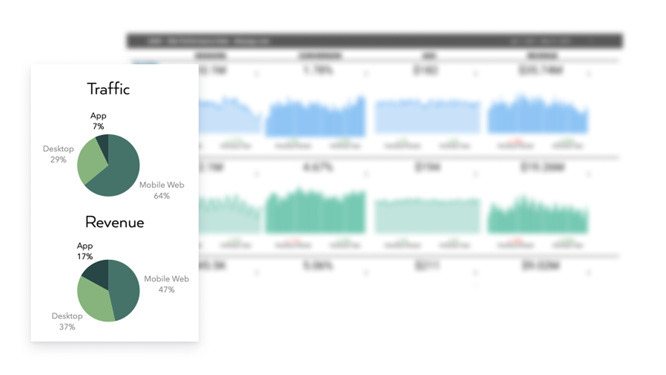
The mobile app’s 184.27% higher conversion rate compared to mobile web made it clear that investing in this channel was critical to driving growth and retention.
With budget allocated to rebuilding the app natively, we had a unique opportunity to reimagine the user experience from the ground up—addressing core pain points, modernizing the UI, and designing a scalable foundation for future growth. Goals:
Improve App Store Rating
Address bugs, enhance feature usability, and optimize app performance to boost user satisfaction and ratings.
Introduce Valuable Features
Drive traffic by delivering reliable, compelling features that encourage regular user engagement and enhance the app’s overall value.
Launch Quickly
Ensure a timely launch of App 2.0 before the expiration of the App 1.0 contract to maintain continuity.
Implement Yoga UI
Set the foundation for long-term success by integrating Alo's new design system for a cohesive and polished user experience.
Digging into the existing experience
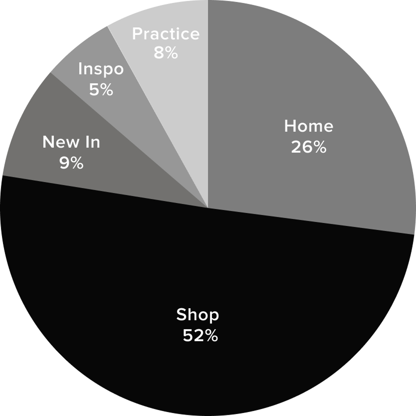

Data from the main navigation told us that 3/5 tabs were underutilized. We wanted to understand why.
Given the app’s high conversion rate, our focus shifted to uncovering ways to enhance the experience and expand adoption.
Understanding the why


Recruiting & Interviewing Users
I partnered with the data team to identify a diverse range of customers, segmented by lifetime value. I then conducted targeted outreach, offering a $100 Alo Yoga credit as an incentive for participating in a 1-hour interview.
Key insights

Discovery & Navigation
- 3 out of the 5 bottom navigation tabs are under-used or duplicative
- App users are goal oriented - they want to get to where they need to go fast - minimal browsing
- Search: UI is not usable & UX is not helpful

Loyalty & Personalization
- No wishlist = missed opportunity - users WANT to come back and shop pieces they love
- Order history is used to shop from to purchase new colors in favorite styles
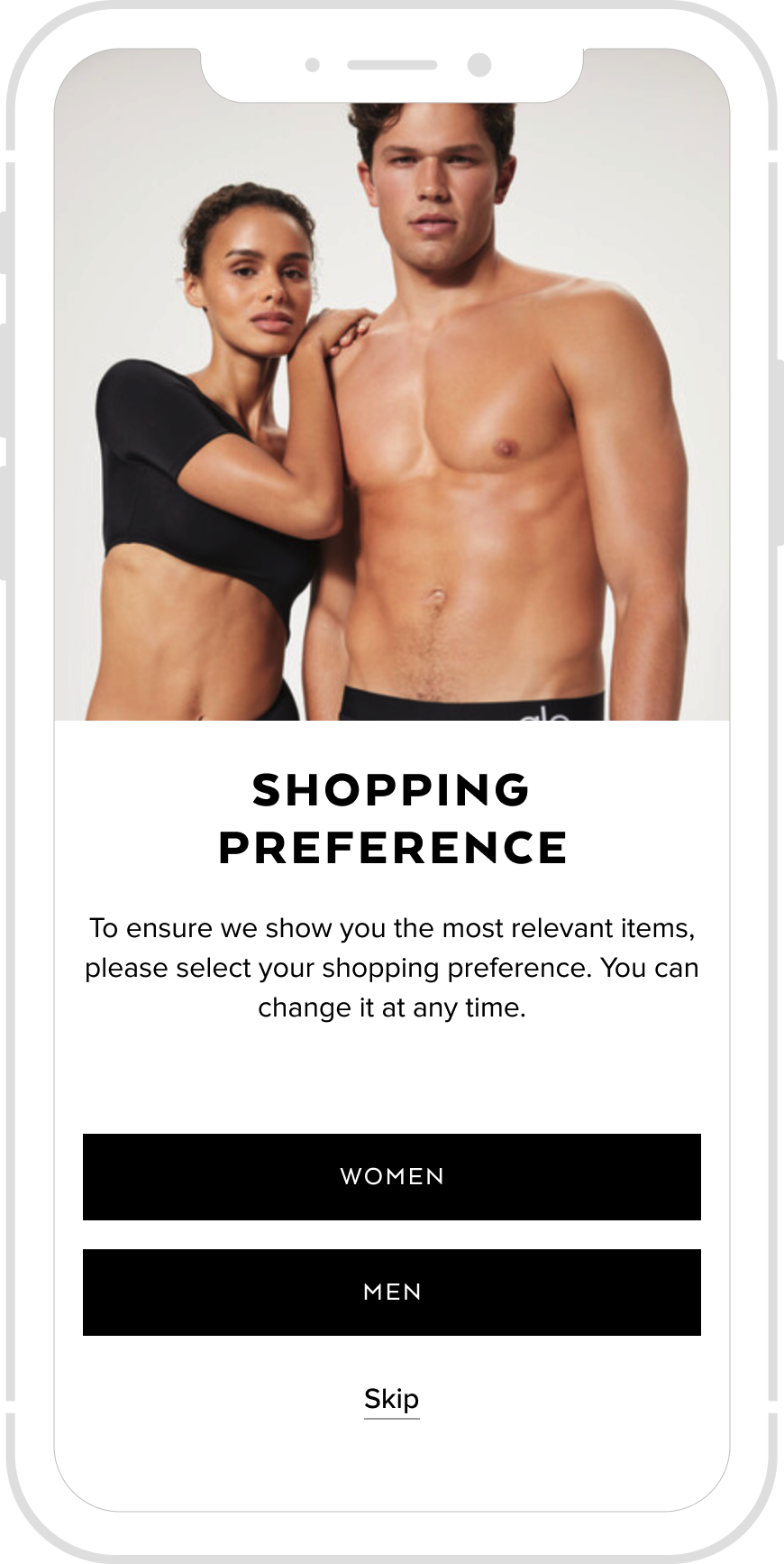
- Users expect to see products relevant to their shopping preferences (men want to see mens)

Features & Performance
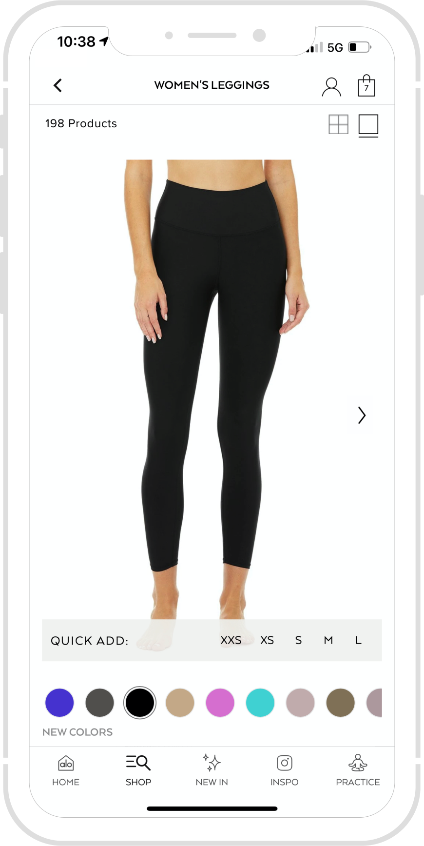
- Grid/list view + quick add is not a usable feature
- Conflicting opinions: "add to bag" confirmation gets in the way, but customers do love having recommended items
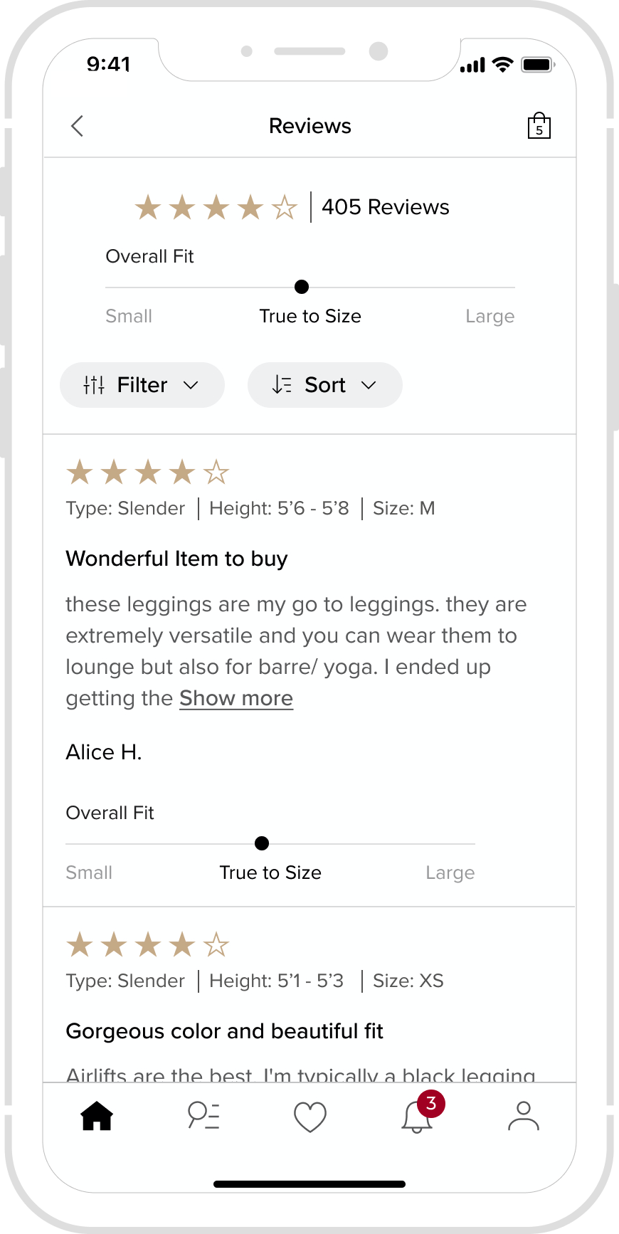
- Reviews are key - but there's too many to read through
- App speed is a major issue
What elements from the current app should we retain, and what aspects should we redesign or introduce to improve the user experience and drive success?
Pitching to leadership
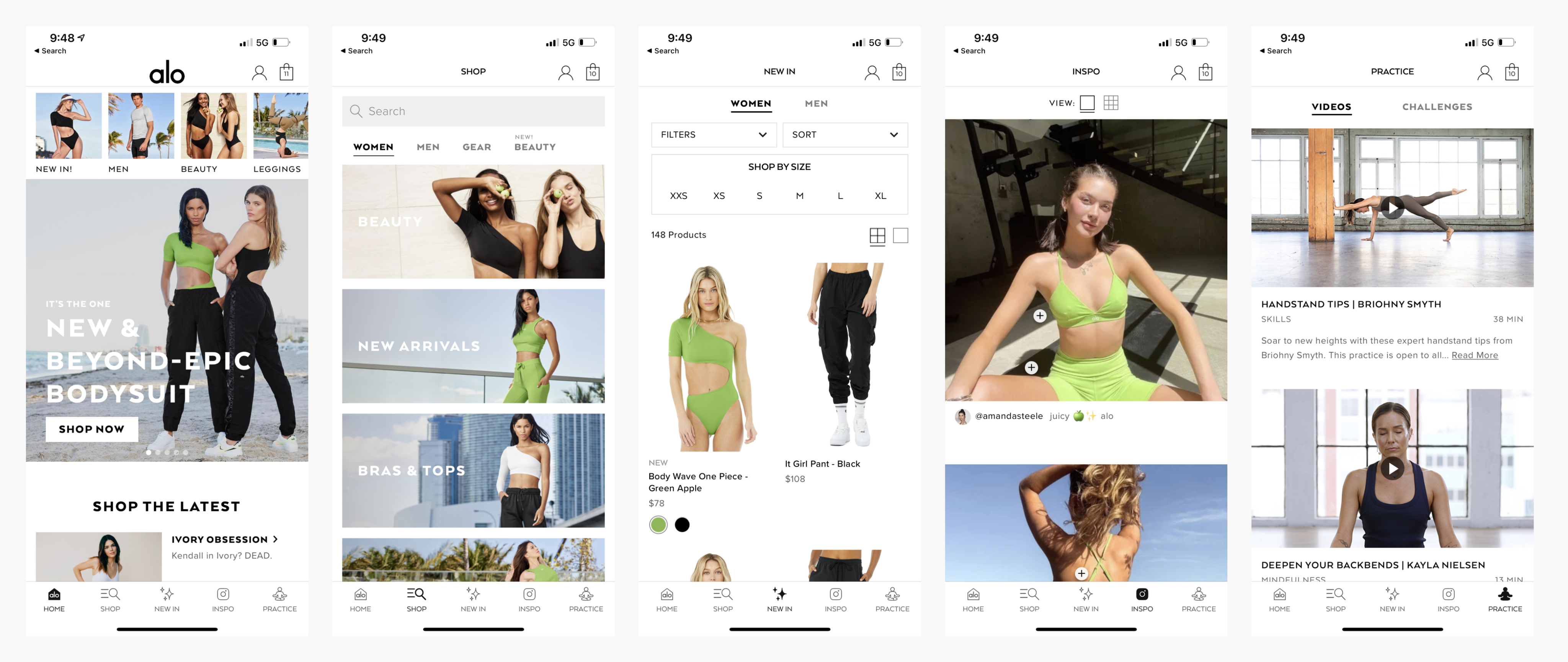
The images on the left are the designs that I worked on.
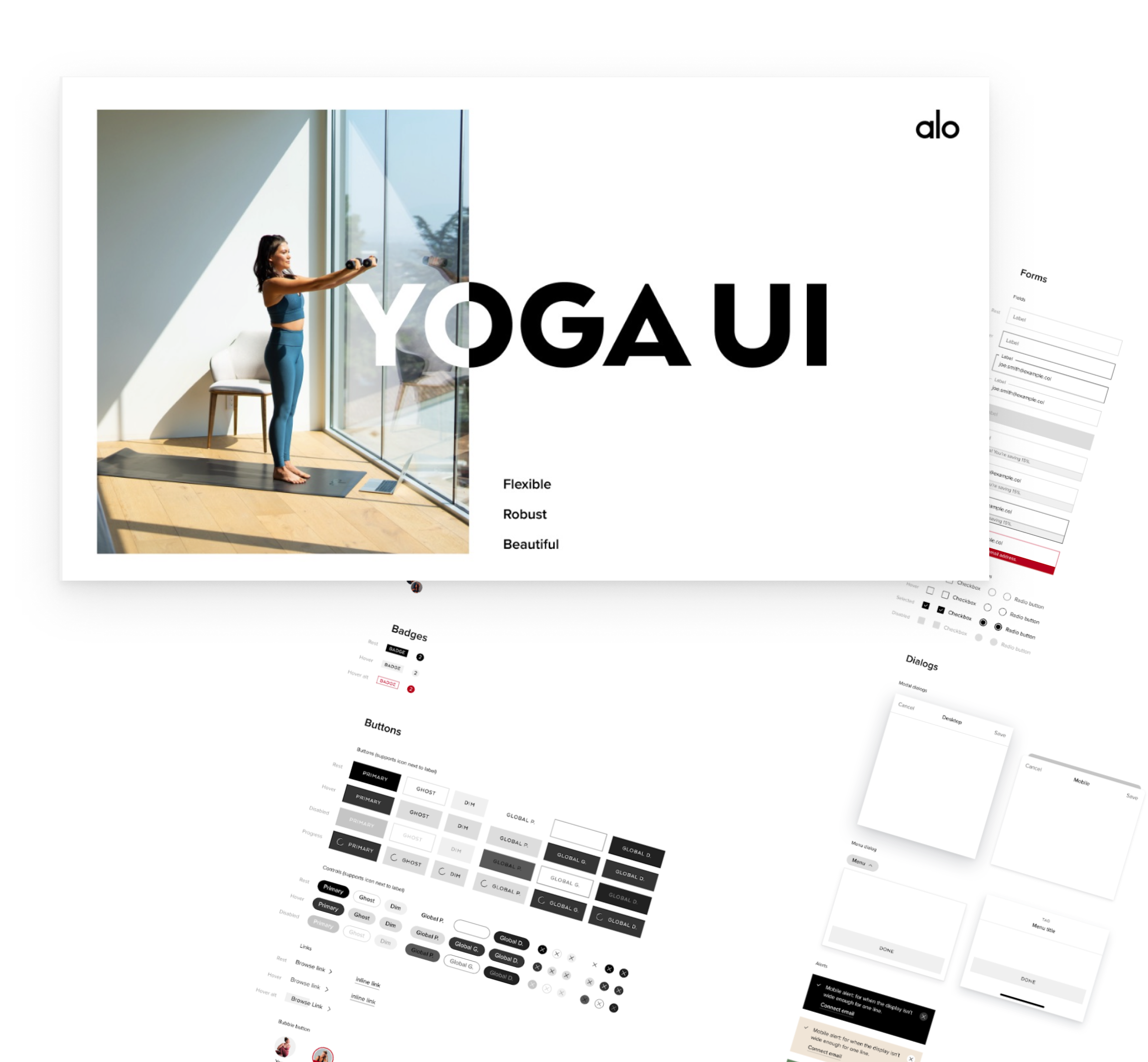
Yoga UI
Build the app using a library of brand components.
• Set a strong foundation for success, enabling efficient future app design and development
• Reduce tech debt by creating reusable components and standardized design patterns
• Ensure a cohesive experience across all Alo brands, reinforcing a unified identity
Surface Useful Features
Giving users what they need at their fingertips to help them along their Alo shopping journey. Rethink what lives in the main bottom navigation of the app & eliminate the clutter.

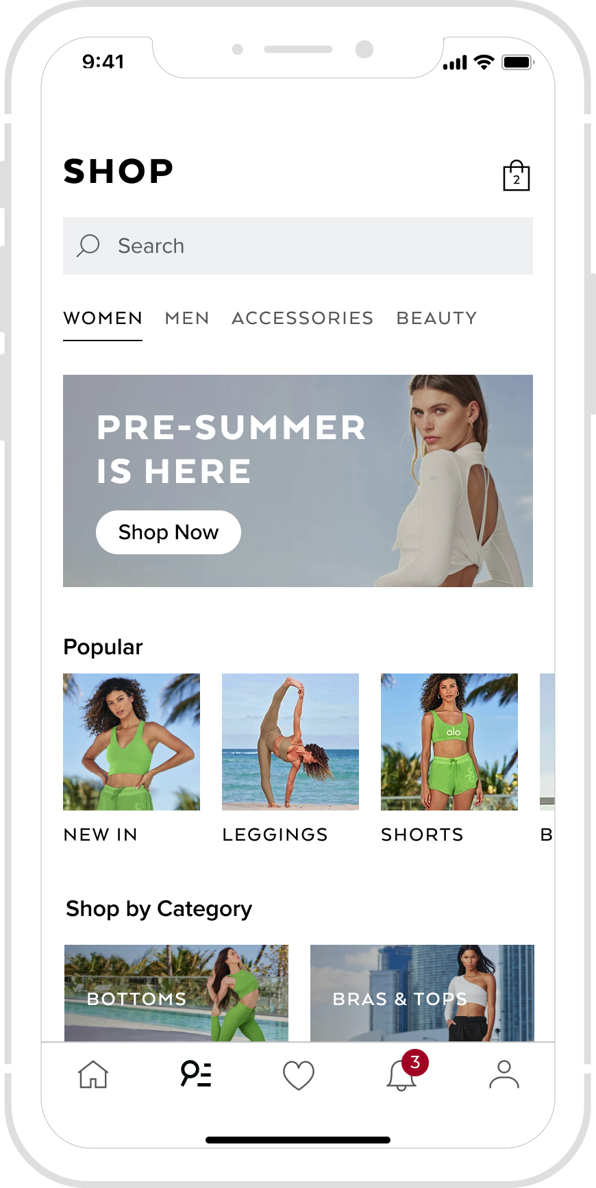
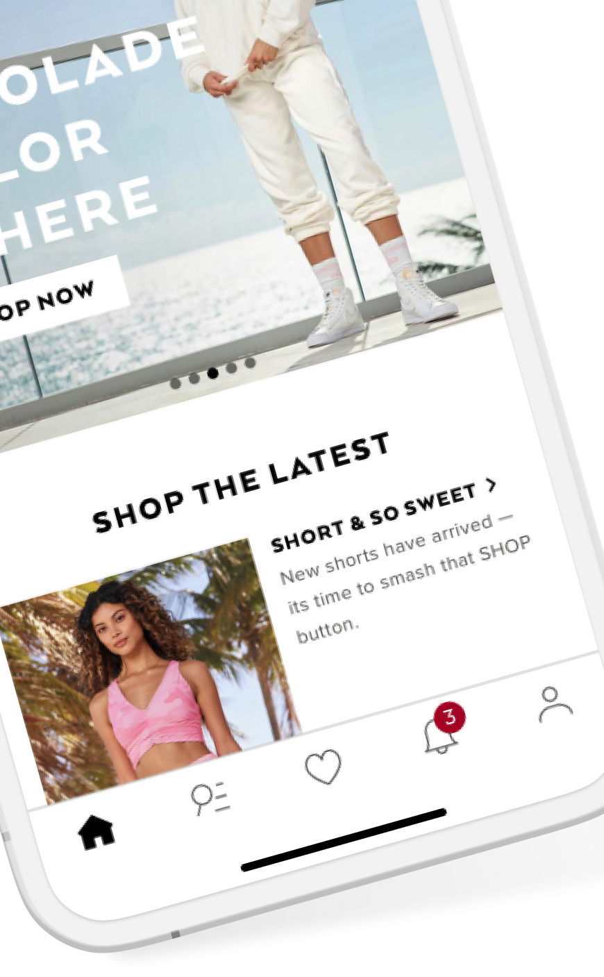
Focus on "Shop"
Open the app directly on the most used tab. Reorganize & explore this tab further to ensure the information architecture aligns with users' mental models.
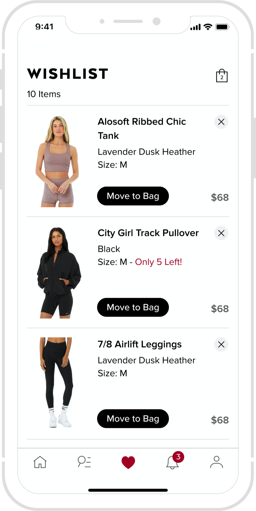
Favorite as You Go
Love something but not ready to purchase? Rather than removing items from the cart, a wishlist feature does the work for the user so that they can come back and shop at ease.
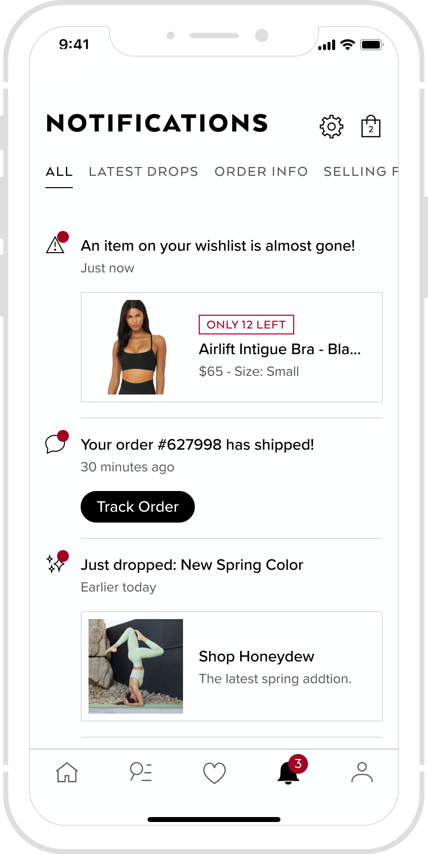
Stay in the Know
I designed a notification center to help customers stay in the know of product drops, items selling out and to stay connected to Alo and all it has to offer. All things the customer loves hearing about.
Let's Get Personal
Seems like a no brainer. But showing the team customer interviews of a user saying "seeing that I'm a dude, I should be seeing men's stuff" was extremely impactful to gain momentum on being more inclusive to our male audience to grow that business. "Shopping preferences" allows for a more personalized experience.
Build with Purpose
To save on development time, I directed the team not to build the view toggle and quick add. 9 out of 9 users said that the list view was too much scrolling and they wouldn't use quick add because they need more information. Data also proves this feature is not used.
Validate Without Adding Friction
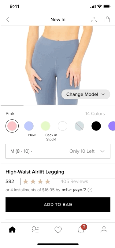
Some users like recommended products, others hated the feeling of a large modal getting in the way. To satisfy both customer groups - I redesigned the confirmation to be less disruptive but still allow a user to engage in shopping more products if they'd like to.
Narrow Down Reviews
Users constantly express how useful reviews are during their decision making process. Many products have accumulated hundreds making it difficult to find relevant reviews. Adding filters to reviews allows users to narrow down on what they're looking for.
Wouldn't it be nice to build all that?
Of course! But given the tight timeline, I partnered with engineering and product management to develop an iterative roadmap. We prioritized the most feasible improvements first—starting with foundational elements like streamlining the navigation and redesigning core flows such as the cart and checkout. Additional features were introduced in later phases, and this phased approach ultimately led to a smoother experience and strong results across adoption and engagement.
A New & Improved Shopping Experience
improvement to conversion rate
increase in app revenue
improvement in app speed
from 3.5 to 4.9 iOS rating
Disrupting the "Normal" Process
Introducing user research early in the process proved to be a turning point. It helped build trust with leadership and justified bold changes that might have otherwise faced resistance. I was proud to introduce Alo Yoga to the value of research-driven design—and even more so to see that buy-in translate into a successful app launch.